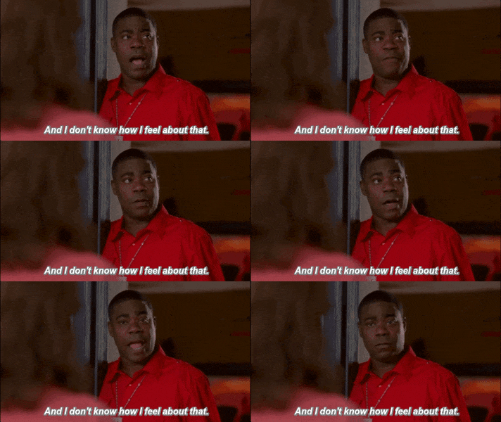
In order to mark a point of difference, this year we will be reviewing the WorldTour jerseys in the only way that makes any sense at all - via the medium of Tracy Morgan gifs.
AG2R La Mondiale
We've gone with blue for the left arm, but we're keeping the brown shorts. Whatever, haters.
Astana
| There is so much camel toe going on here I can't even. |
BMC
Seriously, BMC? No change again? It's like you're not even reading this obscure blog no-one's ever even heard of. Slapping impeclab on the boob is not good enough, and you are looking tired and old.
Cannondale
| I am ashamed. |
Wake up, sheeple. Just because numerous actual publications and proper websites (where Cannondale just happen to spend muchos advertising dollar, conspiracy fans) that people buy and read and respect and stuff have named this as 2016's top jersey dog does not make it so. I say no, Cannondale. No, no, no, no, HELL NO. No. I don't care how adorable your dudes are, you have put them in a lime green abomination, and I call bullshit.
Dimension Data
Fucking SNORE. Team Dimension Data took MTN's original and recognisable jersey from last year and turned it into one of the most boring corporate design snoozefests ever. If that alone wasn't bad enough, they had the audacity to try and ramp up the excitement by making the Team Presentation some sort of jersey unveiling stunt reminiscent of a hellish accountants' Christmas Party Full Monty. It's white. It's black. Ooh, they're all unzipping! PSYCHE! It's the same white jersey as before and we're all looking a bit sheepish. No really, that's what all the fuss is about. Where are you going? We signed Cav you know. He's interesting! Cav, Cav, come out here and flick the V's or something, we're losing them…
Etixx-Quickstep
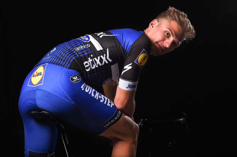 |
| Still fast, still got the hair, still 30% cheaper on your weekly shop. |
FDJ
White shorts, motherfuckers! Fingers crossed for a wet/dry TdF, depending on your crotch viewing preference.
Giant-Alpecin
I hate this ugly excuse for a jersey so so much. I'm going
to go easy on it due to the absolutely horrific training accident suffered by
six of the team, to whom I wish a wholehearted and non-snarky swift and full
recovery - but so help me if the kit looks like this again next year I'm going
to go medieval on it.
IAM Cycling

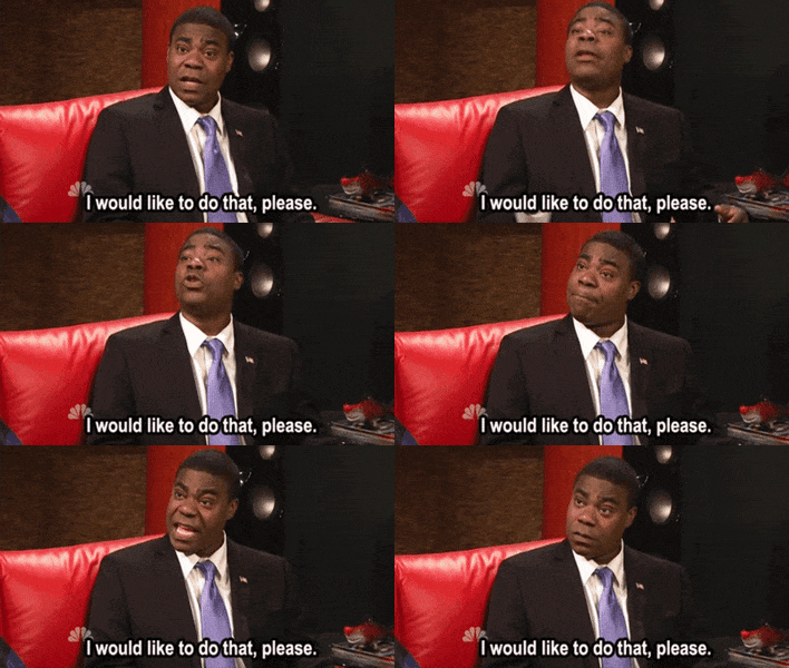
Slick, sophisticated, clean
and stylish. Such a shame no-one's going to see it thanks to the complete
invisibility of the team in all races.

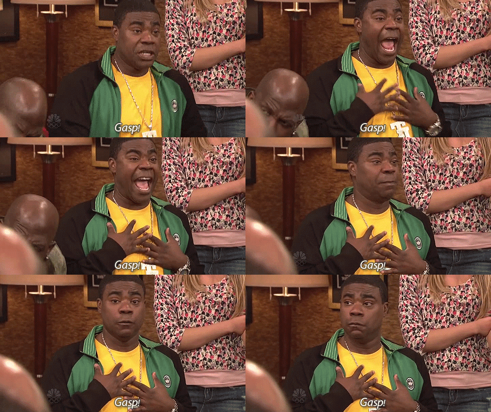
Katusha, dear, this is what happens when you put your boys in red shorts. You become a meme, and not in a good way. I know, get yourselves suspended and no-one will notice...
| Sausage? What sausage? |
Lampre-Merida
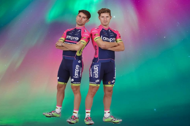
"Right, so we're just going to boil wash and re-issue last year's kit?"
"Yep, but do a google image search on a fancy background for the publicity shots so no-one notices."
"Great idea, boss"
Lotto-Soudal
Best looking kit in the peleton by a mile, no contest. The retro jersey still looks boss, and BLACK SHORTS.
LottoNL-Jumbo
| It's those bastards from Ashburton! Let's have 'em! |
There are no words. Looking like the sort of shit local club run kit worn by your local rivals, you know, the ones you obsessively monitor and report on strava for running segments in their crappy citroens, this was piss poor last year, and is piss poor again this year.
Movistar

Meh, whevs. I'm so
YAWN about this it's not even funny. Like the BMC look, this was fresh
and stylish in it's first incarnation, but is now looking tired and done.
Orica-Greenedge
Yeah, still would. Replaced by Lotto Soudal as my favourite, but this is still a solid No. 2, which as we all know as No. 2's go is vastly preferable to the alternative.
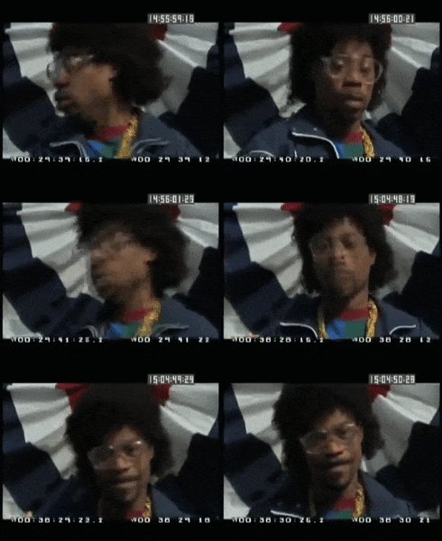
Sky
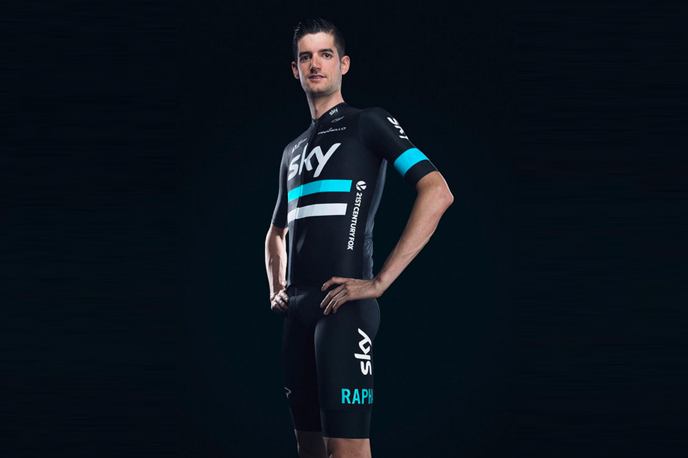
Who'd have thunk it? Rapha have called time on making boring overpriced kit for middle aged men to wear on sportives. Oh no, sorry, my mistake - it just won't say Sky on it past 2016. So no surprises they couldn't be arsed doing anything interesting with the kit in their final year for Sky. They'll still sell in by the bucketload though.
Tinkoff Saxo
 |
| Please let my family go, you promised. |
Everyone's favourite batshit billionaire has announced he's taking his ball back at the end of the 2016 season, but before he rides that invisible horse off into the sunset he's got a few characteristically subtle kit-related stunts to pull. First there was the La Datcha epilepsy-inducing dazzle camouflage training kit to promote, I dunno, his new foray into adult colouring books? Then there was a completely mental half and half tribute to Maradona to commemorate their 3-day blow-and-hookers marathon in 1994 (probably).
| 2017's Messi Tribute jersey (Artist's Impression) |
Trek
 |
| Just keep grinning, Fabs. |
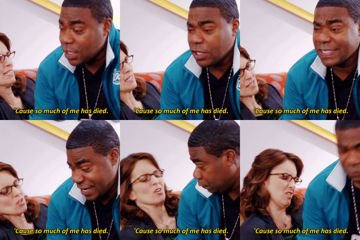
So there we have it. 2016 is officially the most boring season for cycling jerseys like ever. Except… there's this. THIS.
In the inaugural year of Women's WorldTour, Canyon Sram have played the sort of blinder Tinkov can only dream of. And I'm calling it. THIS is the best looking cycling kit I have ever ever seen. And it's bloody RAPHA. And it's for CHICKS. No wonder they've given their notice at Sky.
